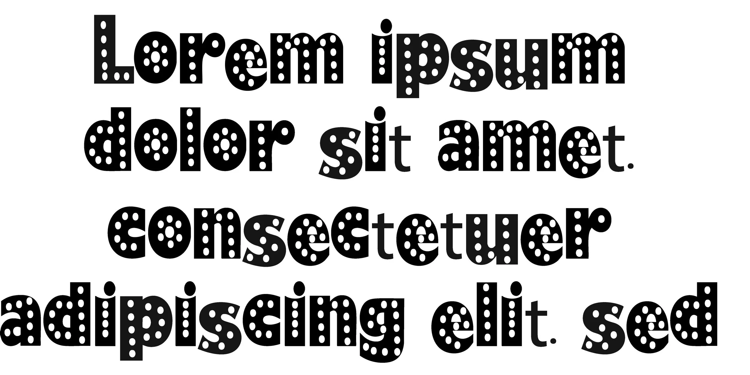
 Image 1 of 3
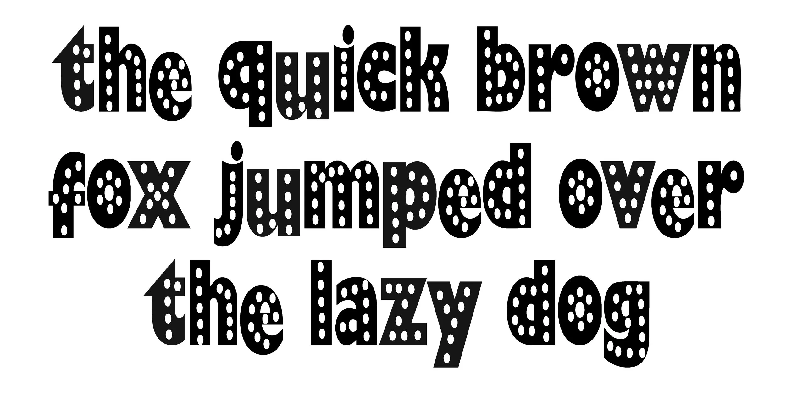 Image 2 of 3
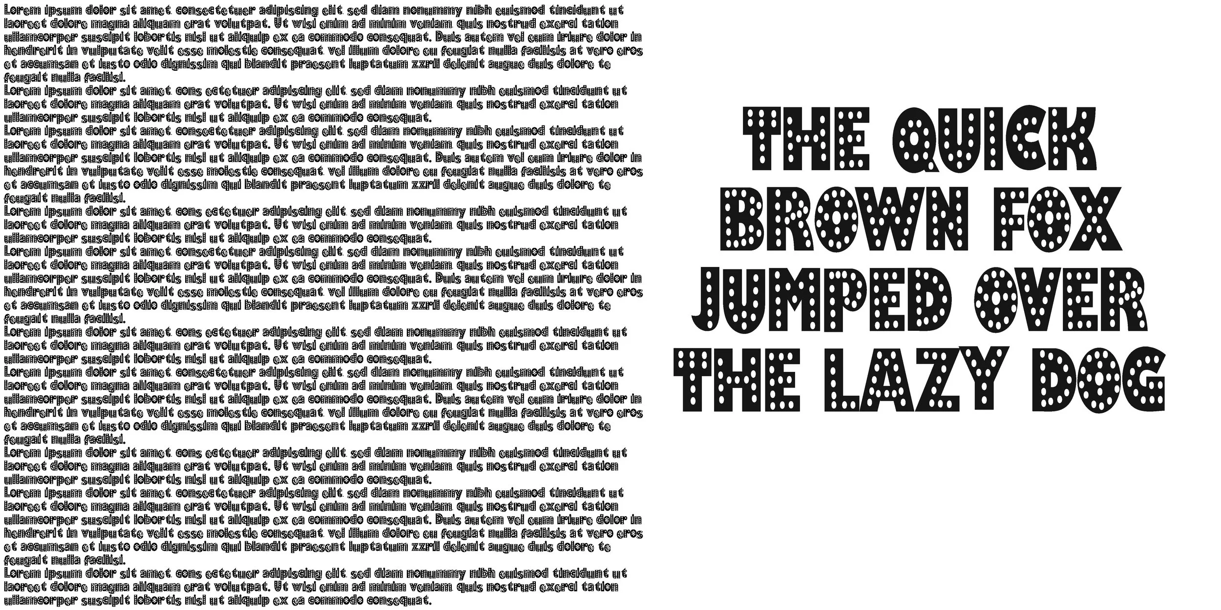 Image 3 of 3
impact, because it isn’t a standard commercial typeface—it was custom-designed for the film’s marketing.
Here’s a clear description:
Tall & Condensed:
Very narrow, elongated letterforms that create a sleek, vertical look.
High Contrast:
Thin strokes combined with slightly thicker terminals give it an elegant, dramatic appearance.
Serif Style:
It uses sharp, pointed serifs, adding a glamorous, almost Art-Deco feel.
Minimalist Structure:
Clean shapes with long vertical emphasis; letters feel stretched and stylish rather than traditional.
Sensual / Theatrical Tone:
The font’s extreme height and slenderness were designed to evoke themes of glamour, performance, and sensuality—fitting the film's Las Vegas show aesthetic.
Custom Integration (Poster Feature):
In the film’s main poster, the letter “I” is replaced by the silhouette of a dancing woman, turning the typography into part of the imagery. This is iconic to the film’s branding.
While the original typeface is custom, fonts often cited as visually similar include:
Showgirls Lettering (fan recreation)
Tall Deco-style serif fonts
Didone-influenced condensed serifs